The TN Quarter Horses logo is a simple design. Based on a logo that the clients had been using for years this updated version included the recognisable Bluey Rey text.
Archives
Essential Midwifery Logo
Erin & Meredith or Essential Midwifery contacted us looking for a logo for their new business that reflected their passion and love for their clients. The final design shows an abstract mother and child in the shape of a heart also loosely featuring their initials ‘e’, ‘m’. Head to the stationery section to see flyers with the logo in action.
Clermont SG Bull Sale logo
A change in location required a new look for the former Charters Towers Santa Gertrudis Bull Sale. Now located in Clermont Central Queensland, we used the shape of a ‘C’ to add a recognisable point of difference to the logo.
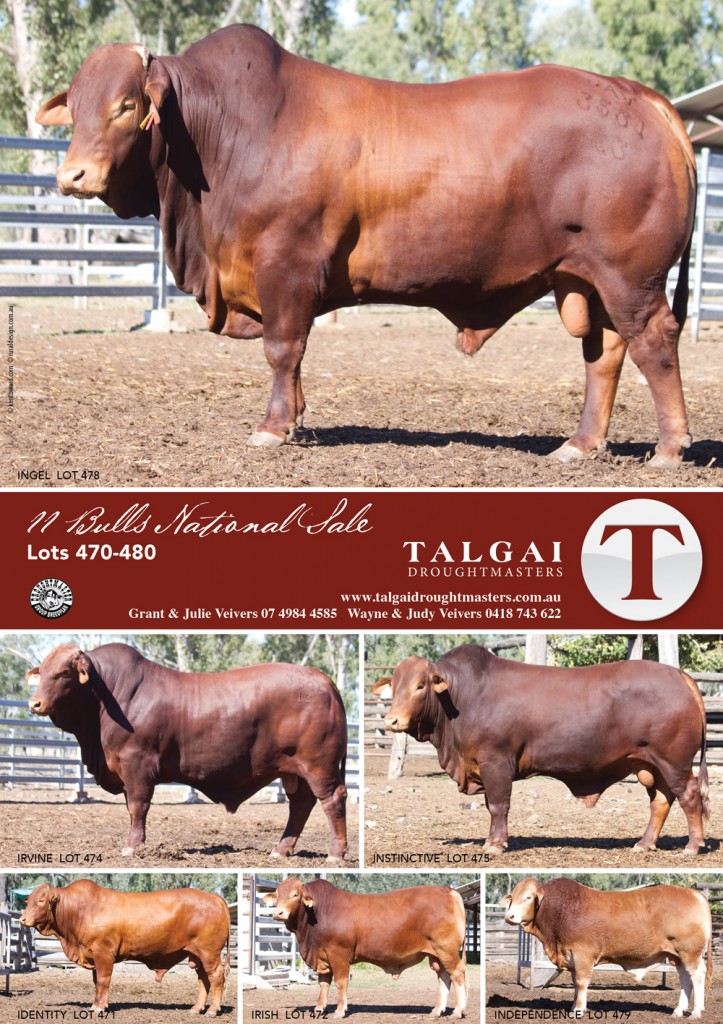
Talgai Digest 2015
One of our many ads in conjunction with KB Consulting featured in the August Droughtmaster Digest 2015. Advertising 6 Taigai Droughtmaster bulls headed for the National Sale 2015 the ad uses a grid design which always works.
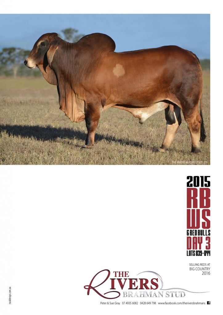
The Rivers
A fresh design for The Rivers Brahman Stud appeared in the Brahman News September 2015. Bold, bold, bold what more do we need to say.
Mr T’s Logo
We created this logo for Mr T’s Children’s Country Clothing as a brother company to Little Miss H Boutique. You might notice that Little Miss H appears in the logo design along side her brother Mr T. The majority of the logo is very simple to draw attention to the characters, also to link to the country clothing aspect of the brand we dress Mr T in a cowboy hat and boots.
Watto’s NCR
We were asked to revamp Watto’s NCR’s previous logo. Check out their Facebook page.
Fernleigh
Having an older font based logo design, Fernleigh Droughtmasters felt that they needed a change and an image to represent their stud. Combining and F monogram with fern design we were able to create a logo that the clients love. We feel that the logo works well and will stand out against competing logos due to the soft gold and grey.
Bimbadeen
Brangus breeders from Eidsvold, Queensland, Bimbadeen; came to us with a logo idea to unveil at Beef Australia 2015. Working closely alongside the client we were able to help them achieve their vision.
Triple 8 Mining
Mining Contactors, Triple 8 Mining, west of Rockhampton, were interested in a logo with a bit of punch to get their business noticed. We chose a pop of red to complement the black, the logo is very bold and eye catching when used on any medium.